Media Website Evaluation
My media product, in this case a charity website uses challenges and develops forms and conventions in many ways. My website uses normal conventions of a charity website such as information about what the charity does and supports to appeal to the audience. I decided to do a charity website dedicated to helping people with ADHD and did some site research to find standard conventions that other charities use on their websites; looking at RSPCA I was able to compare both mine and their website and found evidence that my website does use standard conventions to relate my audience to my website. Site research also ensured that my photographs and video’s fulfilled the conventions to the websites I had looked at by using a similar layout; even the images alone are similar to charity websites. Our website audience is for a wider range of people but aimed more so at younger children and teenagers, therefore we used these types of people in our pictures so it can relate to the audience. Making certain things that little bit aesthetically pleasing can really have a bigger effect on your website therefore some of my photos have been editing using Photoshop. Editing photos also gave me a sense of uniqueness of that I have used my own initiative to make my website my own and develops the conventions in other researched websites.
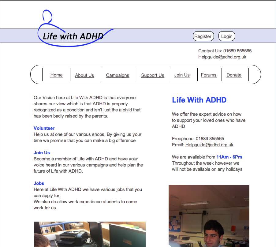
My ADHD website represents particular social groups in many ways. Although ADHD in itself isn’t aimed at any gender or age, I have related my website more towards school children. Again although I never set out an aim of having school children more of a related audience, it does give children a sense of accept ion as they may feel as if they are different. I have done this by using school children in my photos; some include them looking joyful to show they are content with the services the charity provides. From our survey the most popular age of children was between 0 and 5 yrs and 9 till 11 so I decided to have light and friendly colours such as light blue to attract school children. Not only has this but generally children this age lacked the knowledge of ADHD so my website provides this in a friendly manner. The writing across the website is in a language that both older and younger visitors can understand, however the video information which is spoken is in a more formal way so that people watching can understand but take the illness seriously. I have included some features that can relate to most of my audience, especially younger children and teenagers. Features such as face book and YouTube have been added as a link on my website so that visitors can follow us if they want. The layout of my website is modern with the navigation bar near the top so that younger people do not get confused; it’s a rather simple layout so that it doesn’t confuse any visitor.
There are many kinds of media institutions that might distribute my product starting with web servers. Web servers can distribute my website through either a wired connection or a wireless connection which will then go through to an internet provider. Providers such as SKY and AOL can then distribute my website. Difficulty to distribute a website compared to a radio programme or a film is tough as radio and film are able to advertise in many places which gets to a wide range of audiences. Going back to what I said about the different features my website contains such as face book and YouTube, these are very good places to advertise and promote a website. Social networking sites have increased the number of advertisements they have as media products such as mine are willing to pay social networking sites so they can get there product across to a wide audience.
Using the results of the surveys I sent out and looking back at my website the target audience is mostly children from 2 till about 16. I know 2 year olds won’t be familiar with the internet yet but ADHD may be part of their lives so this is where adults come in to my target audience. Adults too however are liable to ADHD and can suffer from it, but it’s more common in children but adult’s whose children suffer from it can use my website. 17 out of 30 people who did our survey say they strongly agree for an organisation such as ADHD to have a website and 11 out of 30 say they agree so it’s clear that most people will recognise that this is an important charity. When doing some research on ADHD I found out that males are more prone to suffering from ADHD than female and my results show this with 23 out of 30 people were in fact males. Only 5 out of 30 disagreed on the fact that forums were not important on a charity website so I had to accommodate for the rest of the participants who thought that it was necessary by adding a forum to my website to appeal to the majority. 3 people out of the 30 said that they disagree about having a help line number on the home page of my website so to appeal to the 27 who said that it was important, I added a number to the home page.
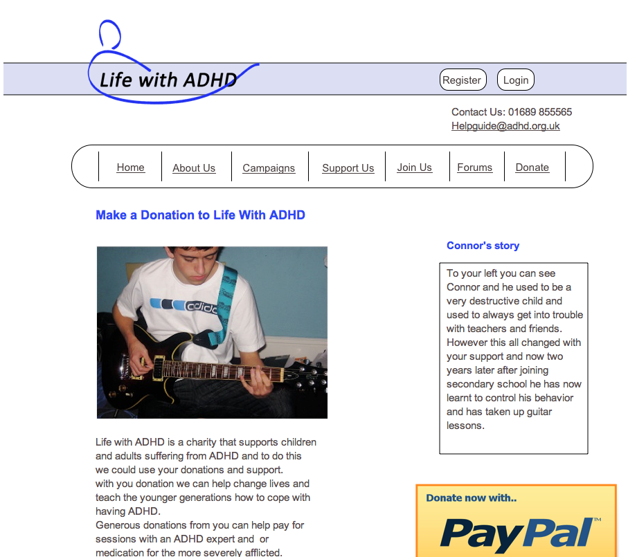
To attract my target audience I had used a video on the home page which explains how and why people get ADHD, this can interest the who ever the visitor is as they could feel related to it. The pictures of children at school who were receiving help from teachers relate to most of my audience as there are more school children with ADHD than adults with it. However there are some photos of adults involved in the charity which can relate to adults as they may feel that they want to get involved by volunteering or donating ECT. Using practical stories such as going to football matches after receiving help and being able to play guitar can relate to the younger and even the older community of ADHD so I felt the need to add something more readable and intriguing. Using friendly colours such as baby blue, white and light grey can attract my target audience as blue can come across as calm which would benefit from people with ADHD to calm them down perhaps and isn’t “in your face” all the time which makes my website easier to use. Having the name of the charity and the logo at the top of every page is important as it shows consistency on every page, also visitors will be attracted as they know that the website may look professional therefore thinking the same about the actual charity. The light grey shade of writing goes well with the white background and the light blue around the edges which can draw visitor attention.
I have learned many things about technologies from the process of constructing my website. When constructing my preliminary website I found it difficult at first to get the grips of using different software’s such as iweb, Photoshop and final cut express. But when making my preliminary product I started to get to know the basics and started using Photoshop to edit photographs and my logo. After a couple of hours on iweb I started to get to know the software and was able to create a simple looking website which I would look to develop when creating my main website. Using final cut express to edit my video to make it more appealing really allowed me to know how to use it and I hoped to widen my knowledge on it for my main website. Even though I eventually got to know how to use these programmes I never really was taught thoroughly on how to use them so for the majority of the time had to learn as I went through them myself. My creative process for my preliminary website was very basic as I was new to the whole concept of the programmes but I really wanted to broaden my knowledge about them to make full potential of my main website.
Looking back at my preliminary website I was able to learn the programmes needed for my main one. Using Photoshop for my first website allowed me to take one step further for my main website by making a new logo, editing more photos and writing. Using final cut express was hard at first but for my main website wasn’t as difficult as I had used it before. Iweb was now a daily programme to me which I was able to take to my advantage by making 8 pages for my main website. I also developed a wider range of creative skills with evidence of much more links such as Face book, you tube and many more. I was also able to add a Google search bar through html whereas my preliminary website had nothing of the type which indicates that that my skills did develop during the creation of both websites. When I compare both my main website with my first one I see that my layout and colours skills slightly develop as I hade a little change of target audiences, the language is pretty much the same as both websites a formal. I think doing research on other websites really help my creative thinking during the course of the time and allowed me to add some interesting features to both websites, more so on the main website.
George Jardine